Search plugin settings
The Zoovu Search Plugin offers multiple configuration settings to help you customize search behavior, results display, and user interactions. This guide provides an overview of configuration options and how to customize the search experience.
Features and components
| Feature/component | Description | Configuration object | Additional information |
|---|---|---|---|
| Search box | Allows to connect to an existing search box or inject a new one | searchBox | |
| Styling | Allows to define accent and theme color, set the loader type, and add custom css | style | |
| Layout | Defines the SERP layout and which parts of the result card should be displayed | layout.mobile, layout.desktop | |
| Navigation and result groups | Defines the navigation type for multiple result groups on SERP (tabs/scroll), the behavior of the "All results" tab, and allows to include/exclude certain result groups | layout.navigation, contentGroups | |
| Autocomplete | Shows product/content results while typing, empty state (after a search box is focused but no text is entered) and query based results are configured independently | suggestions | The configuration options for empty state and query based suggestions in the Design & Publish interface are limited, nevertheless in the code any number of blocks can be defined and additional styling options are also available (suggestions.source.emptyState, suggestions.source.emptyState) |
| Search result page | Defines how the SERP should be integrated (layover/embed/fullscreen), result card components, UI labels,... | results | |
| Sorting | Customizes the style of the sorting, allows to display sorting as tabs if only a single result group is available | results.sorting, results.sortingParamName, results.orderOptionsAsTabs, results.defaultOrderOptionLabel | |
| Filters | Controls the filter behavior - the filter position, whether quick delete bar should be displayed,... | filters | |
| Related queries | Displays queries that are frequently searched along with the current search term | results.showRelatedQueries, results.relatedQueriesPosition | |
| Pagination | Controls the behavior of the pagination and allows to display a page size selector | results.moreResultsPagingSize, results.pageDescriptionLabel, results.showPageSizeSelector, results.pageSizeOptions | |
| Data points | Allows to exclude certain data points from the result card and defines how those are visualized | dataPoints | |
| Relations | Allows to display a relations CTA in the result card, defines how related products should be displayed (inline/drawer/layover) | similarContent | Relations |
| No results page | Defines what blocks should be displayed when no results match the current search term | noResultsPage | |
| Zoe integration | Allows to integrate Zoe to enable users asking questions about a product in the result set | zoe | |
| Comparison | If enabled, a "compare" button will be displayed in product cards | comparison | Attributes for comparison must be configured in Data Platform > Comparisons |
| Mini PDP | Displays a "mini PDP" (quick view showing the images, specifications, related products,...) instead of redirecting the user to the product after a product result is selected | miniPDP | Attributes to be displayed as specifications need to be defined via attribute groups |
| Animated search box placeholder | Allows to animate the placeholder of the search box to simulate a query being entered | searchBox.animatedPlaceholder | Queries can either be manually defined, or are automatically taken from the query log |
| Category search + landing pages | Allows to replace the customer's category/landing pages with the Search Plugin | - | |
| Checkout tracking | Allows to add additional tracking configuration to capture 'add-to-cart' on PDP and 'checkout' events | tracking.external | |
| Query term highlighting | Allows to highlight search term matches on content/product pages after a Result Mapping redirect/clickout | queryTerm | |
| Smart 404 | Allows to replace customer's 404 page with relevant search results (pages that might be relevant based on the URL slug) | smart404 |
Step 1: Set up Attribute Groups, filters, and sorting
Start by configuring the data required for the search UI: Attribute Groups, filters, and sorting.
Attribute Groups
Attribute Groups define the attributes needed for search results to display correctly. These attributes can be:
- Displayed directly (e.g. price, product name).
- Used as helpers (e.g. hiding "Add to cart" if stock = 0).
To configure Attribute Groups, go to Data Platform > Ontology > Attribute Groups.
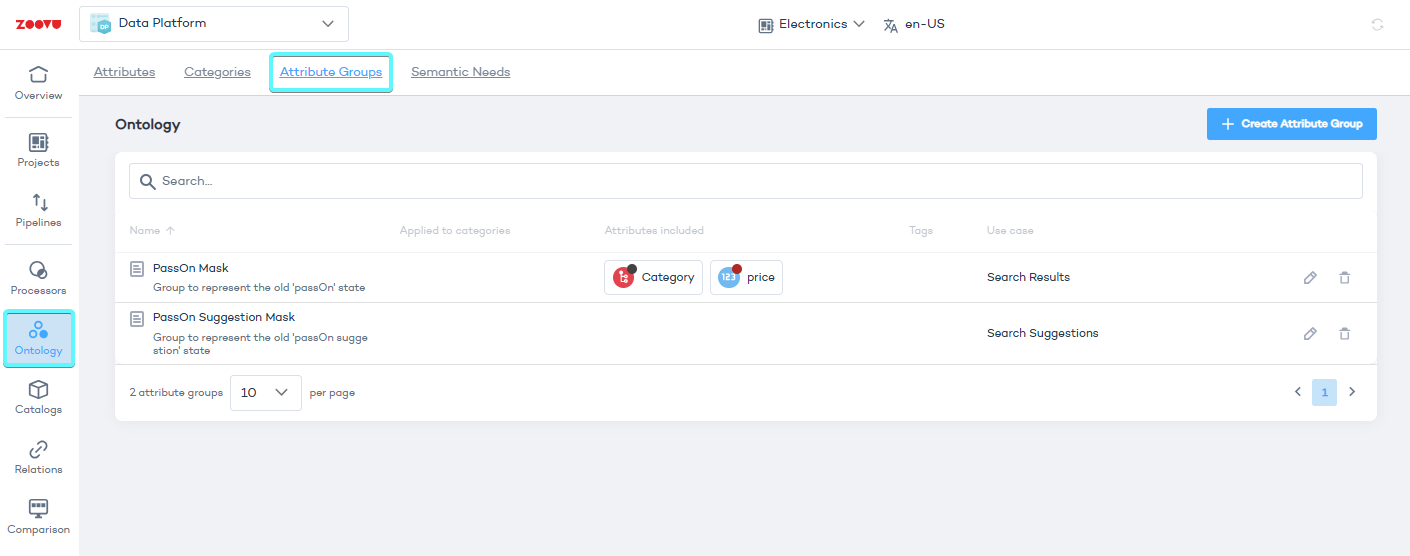
Only configure the Attribute Groups that are truly needed. Adding too many attributes can slow down search response times.
Filters and sorting
Filters and sorting allow users to refine and organize search results.
To configure:
- Go to Search Studio > Filters and Sorting.
- Define the filters that users can apply.
- Set up the sorting options.
Step 2: Create and preview the search plugin configuration
Once Attribute Groups, filters, and sorting are set up, go to Search Studio > Design & Publish to configure the search plugin. Learn more.
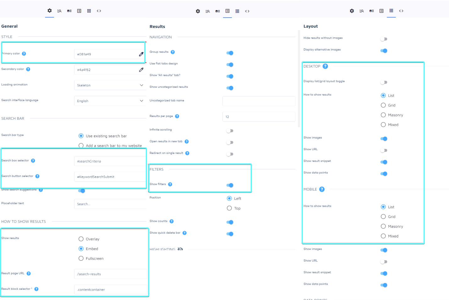
Initial setup:
- Set the primary color to match your branding (used for buttons and UI elements).
- Search box and button selectors – CSS selectors pointing to the search box and button on your site.
- How to show results – Embed search results on your search results page.
- Enable filters.
- Configure the search result layout for desktop and mobile.
Important: If search results share the same URL as the native search on your website (e.g. the /search-resulrs slug), use a different parameter to avoid slowing down the page.
Preview options
You can preview the search UI using:
- Built-in preview (recommended).
- Chrome extension (Tampermonkey) – Injects the plugin on the live site.
- Your dev/staging site – Requires adding a search code snippet.
Built-in preview
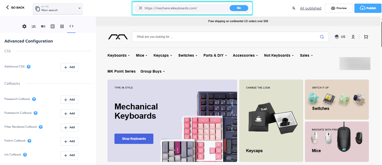
Go to Search Studio > Design & Publish and enter your domain in the field on top of the page.
Advantages:
- Works instantly, no need to publish.
- Can be opened in a new tab for full-screen preview.
- Prevents conflicts if search is already live on your site.
In the built-in preview, redirects may not work as expected and stylesheets/assets may not load correctly.
Step 3: Customize search result cards
You can modify search result cards in two ways:
Option 1: Override the result renderer. Customize specific elements while keeping existing features.
Option 2: Use templating. – Define a completely new layout using HTML and placeholders. Learn more.
Step 4: Customize filters and autocomplete
Style filters
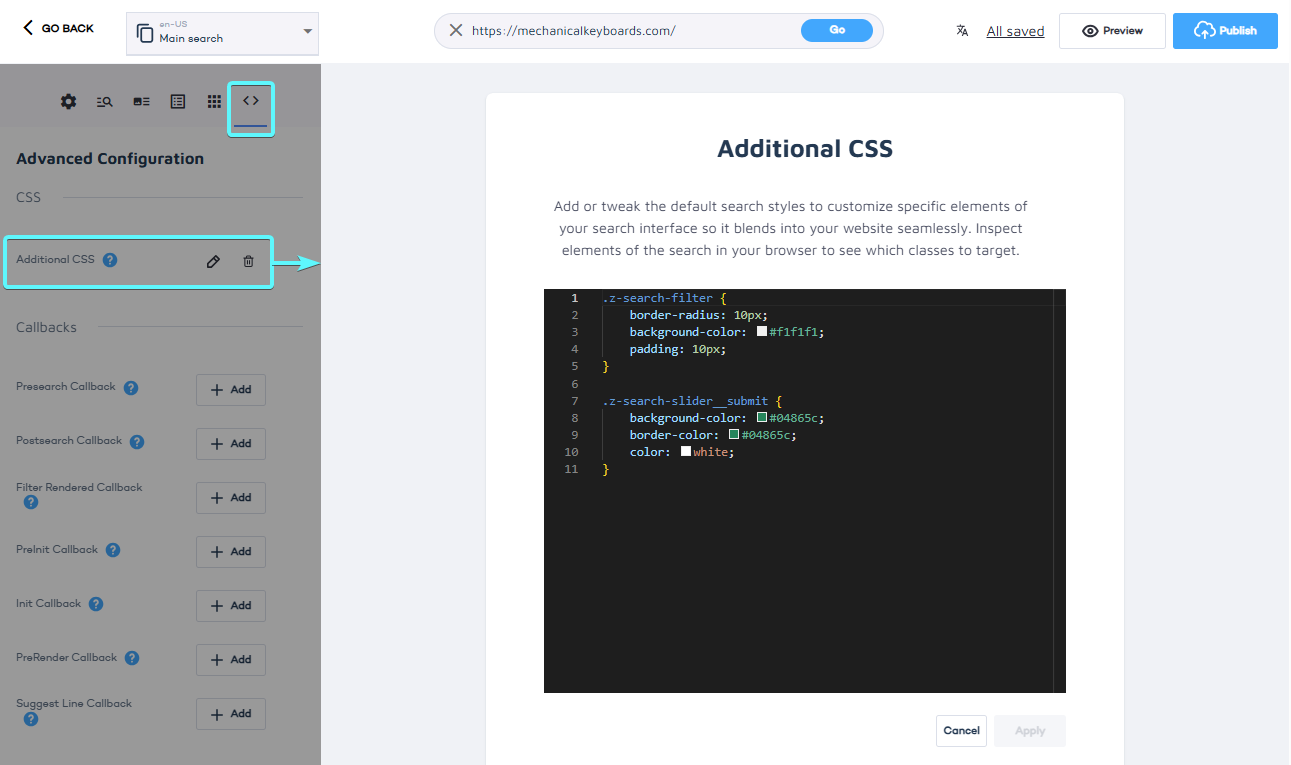
To match the filter styling to your UI:
- Go to Design & Publish > Advanced > Additional CSS.
- Add custom CSS, for example:
.z-search-filter {
	border-radius: 10px;
	}
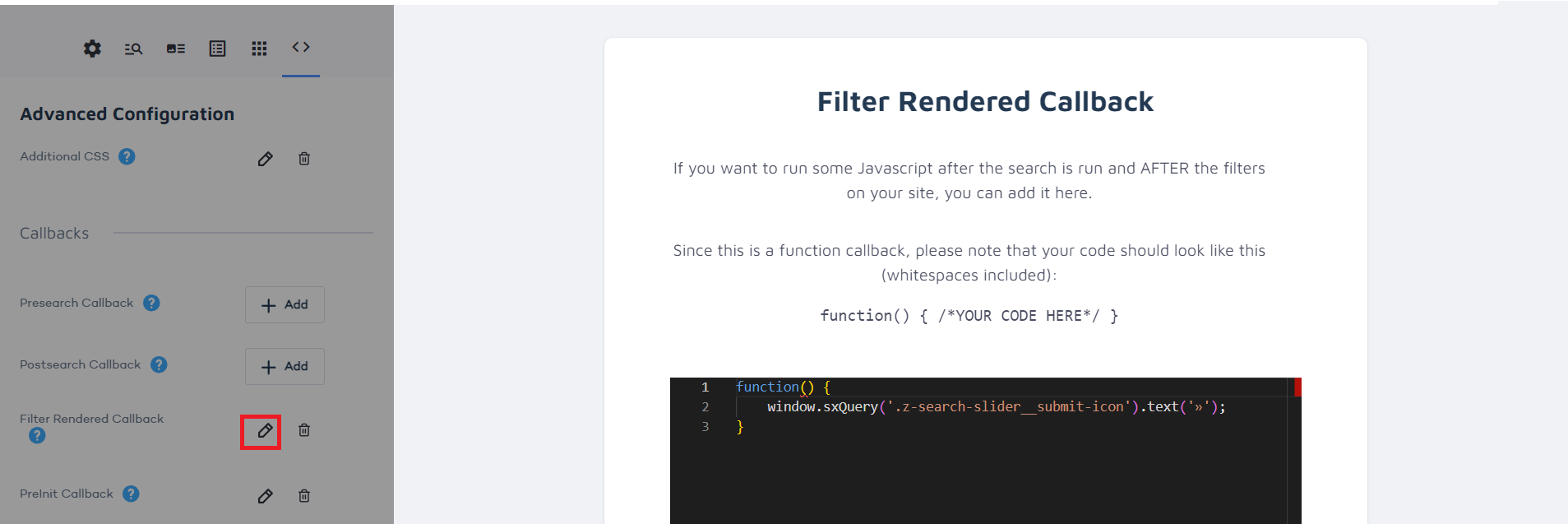
To override the submit button label, you can use the Filter Rendered callback to replace the button text with »:
function() {
	window.sxQuery('.z-search-slider__submit-icon').text('»');
}
Adjust autocomplete
You can modify the autocomplete layout and styling to align with your search suggestions.
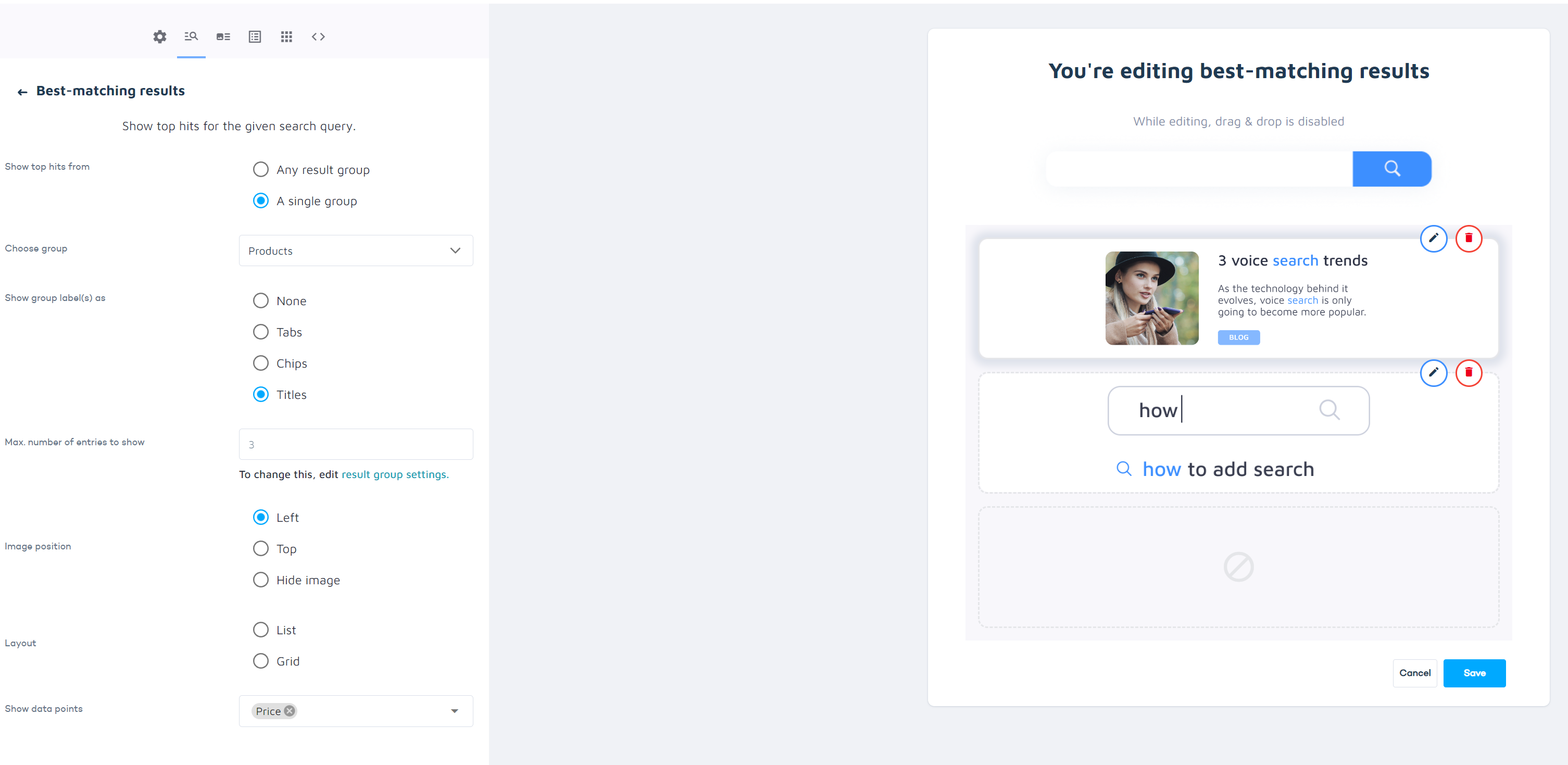
Start by configuring the price data point to be displayed in the Products result group in Design & Publish > Suggestions > Query-Based:
Then you can add a few lines of CSS, for example:
.unibox {
	border-radius: 0;
	color: #000;
	font-weight: 700;
}
Step 5: Publish the search configuration
Once everything is tested and ready:
- Click Publish in Search Studio > Design & Publish.
- Embed the generated code snippet in your website.
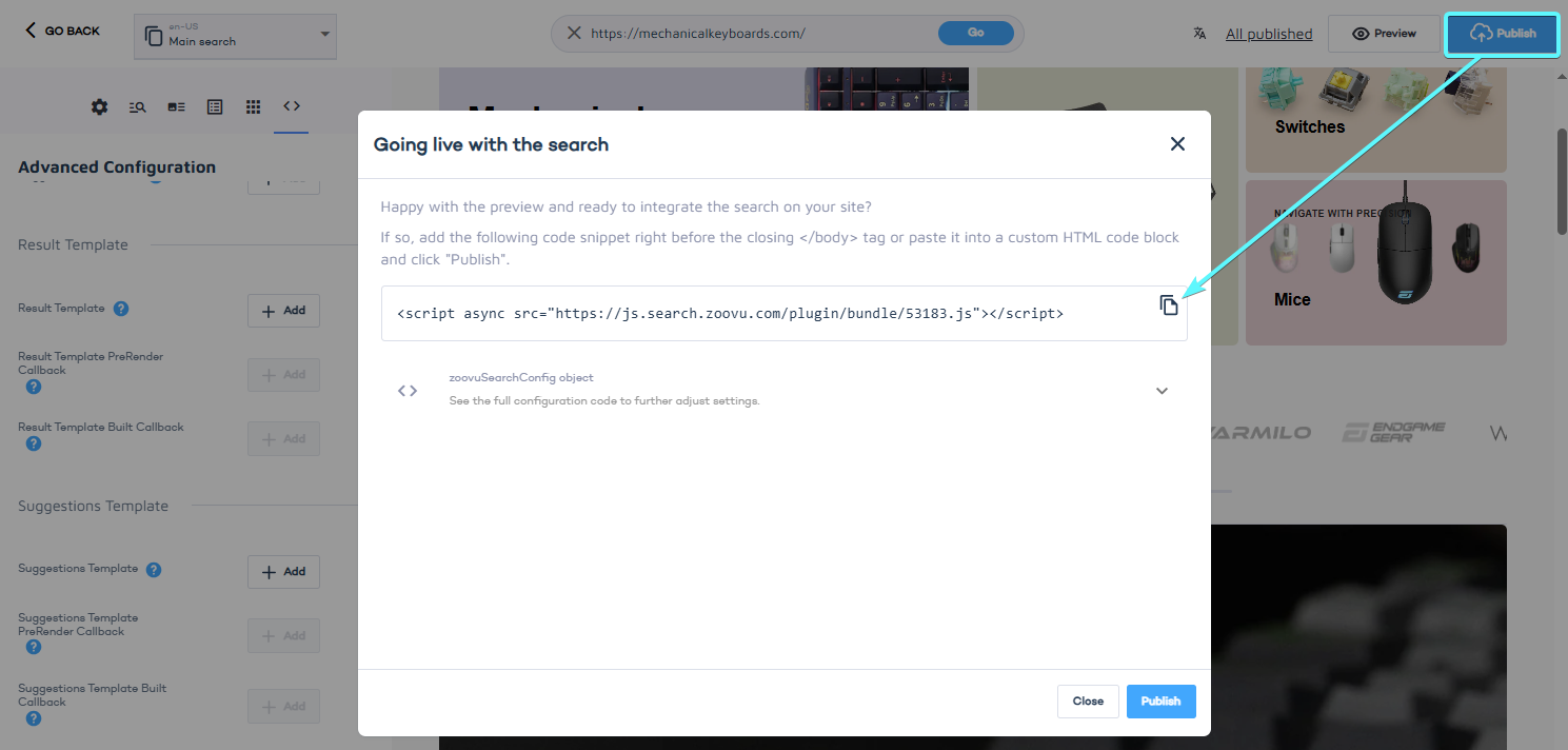
Any changes made after publishing remain in draft mode until you publish again.
Integrating search on category and landing pages
You can integrate Zoovu Search on any category or landing page by adding a configuration snippet to your HTML. This creates a new search plugin instance that inherits settings from your main configuration but remains independent.
To configure the search on category or landing pages, you need to define either:
query – Executes a search for a specific term (useful for landing pages).
breadcrumb – Defines navigation-based search results (useful for category pages).
Example: Rendering all products for a specific brand
The following configuration renders all products under the Microsoft brand:
<script id="zoovu-search-landing-page-config" type="application/json">
{
	"query": "*",
	"results": {
		"filters": [{"name":"Brand", "type":"products", "values":[{"name":"Microsoft"}]}],
		"embedConfig": { "contentBlock": "#landing-page-content" }
	}
}
</script>
Example: Rendering products for a specific category
The following configuration displays products from the Notebooks > Accessories category:
<script id="zoovu-search-landing-page-config" type="application/json">
{
	"breadcrumb": ["Notebooks", "Accessories"],
	"results": {
		"embedConfig": { "contentBlock": "#category-page-content" }
	}
}
</script>
Customization options
Any setting available in the standard search configuration can also be applied to category and landing pages. For example, you can adjust the embed configuration to control where search results appear.
Important: The id="zoovu-search-landing-page-config" attribute is required. The content must be a valid JSON object.
Controlling search with the API
Zoovu Search provides a public API that allows you to modify search behavior dynamically. You can use it to:
- Open specific result groups based on query content.
- Adjust how search results are displayed in different contexts.
Example: Opening a specific result group
If you want searches related to bills to open the "Support" tab by default, you can use the following post-search callback:
/* Postsearch Callback */
function(data) {
	const query = data.interpretedQuery.original.toLowerCase();
	if (query.split(' ').indexOf('bill') !== -1) {
		window.ZOOVU_SEARCH.openTab('Support'); // Focus Support tab for bill-related queries
	}
}
For a full list of available methods, go to the JavaScript API documentation.
Customizing search results with templating
If your search results contain both products and content, you may need to adjust their markup. This can be done using templating.
Example: Differentiating products and content
To add a custom property that identifies whether a result is a product or not, use the pre-render callback:
function(result, _store, contentGroup) {
	result.isProduct = contentGroup === 'Products';
}
Then, modify the template to apply different styles based on this property:
{{#isProduct}}
	<span class="product-title">{{name}}</span>
{{/isProduct}}
{{!#isProduct}}
	<div class="content-title">{{name}}</div>
{{/isProduct}}
You can add any custom property to search results using the pre-render callback to control search result layouts.
Previewing draft changes
If your Design & Publish configuration has already been published, but you want to test new changes before going live, you can preview the draft version by appending ?draft=true to the bundle URL:
<script async src="https://js.search.zoovu.com/plugin/bundle/xxx.js?draft=true"></script>
Use callbacks for advanced customizations
Callbacks allow you to modify the search behavior dynamically. You can add them to your plugin configuration in Design & Publish > Advanced configuration.
| Callback | Description | Arguments | Main use-case |
|---|---|---|---|
| preInit | Called before the search plugin is initialized. | The configuration object. | Applying dynamic settings or adding callbacks. |
| init | Called after the search plugin is initialized. | - | - |
| suggestChange | Called after autocomplete data set is changed. | Boolean flag indicating whether autocomplete is visible, and the data set. | - |
| redirect | A custom code to handle redirecting to a certain page (via result mapping or on single result). | Redirect url. | - |
| enter | Called after enter is pressed while the search box is focused. | The search term. | - |
| preSearch | Called before a search request is executed. | The search term, sorting, search box reference, filters, and additional search request options. | Modifying settings based on a query, or filtering queries that should not be executed. Must return true if the query should be submitted. |
| postSearch | Called after a search request is executed and results are rendered. | Search API response. | Modifying on SERP interface, reporting. |
| preSuggest | Called before a search suggestion request is executed. | Search query and search box reference. | Modifying settings based on a query, or filtering queries that should not be executed. Must return true if the suggestion request should be executed. |
| searchResult | Called after the search response is received. | Search API response. | Rendering a completely custom SERP. |
| closeLayer | Called after layover/fullscreen SERP is closed. | - | - |
| moreResults | Called after "show more" button is clicked. | Number of visible search results, maximum number of available results, result group name, search API response. | - |
| resultImageError | Called after a result image fails to load. | The result card. | Custom handling of placeholder images. |
| suggestLine | Called after an autocomplete item is created. | Item HTML, result group name, index, and the item data. | Modifying the autocomplete item markup. |
| resultLine | Called after a result card node is created. | Result/product data, result HTML node. | Modifying a result card. |
| navigationClick | Called after a result group is changed. | Active result group name. | Customizing parts of the SERP based on the active result group. |
| preRender | Called before the SERP is rendered for a given search term. | All loaded search results, search API response. | Modifying the search response, ordering result groups. |
| suggestPreRender | Called before the autocomplete dropdown is rendered for a given search term. | All loaded autocomplete blocks. | Modifying the data to be rendered. |
| filterRendered | Called after the filters are rendered. | - | Modifying the filter interface. |
| searchError | Called if a search request fails. | - | Handling failed searches. |
| suggestPostRender | Called after the autocomplete dropdown is rendered. | - | Modifying the autocomplete interface. |
| imageLoaded | Called after an image on the SERP is loaded. | Image node, image src. | - |
| queryModification | Called before the search request is executed. | The current search query and search options. | Modifying the search term before it is executed, must return a query to be executed. |
| focus | Called after a search box is focused. | Event, current value of the input element. | - |
| blur | Called after a search box is blurred. | Event, current value of the input element. | - |
| enterResult | Called after an autocomplete item is selected. | Current search term (based on the item name), item link, a boolean flag indicating whether the item should be opened in a new tab, search box value. | - |
| type | Called on search box input. | Input event, search box value. | - |
| resultsPreloaded | Called after the next page is preloaded. | Search API response. | Modifying the preloaded data. |
| preloadedResultsRendered | Called after the next page is preloaded and rendered | Search API response. | Modifying preloaded result cards. |
| suggestsLoaded | Called after autocomplete data is loaded. | The autocomplete blocks. | Modifying autocomplete data. |
| noResultsLoaded | Called after a search or suggestion request returns no results. | The search query, search context ('search' or 'suggestions'), search API response. | Handling 0 results, if true is returned, the request will be repeated. For example we might need to change the catalog id if no results are available and the search query matches a certain pattern. |
| singleResultPreRenderCallback | Called before a result card is rendered. | The result data, product variants. | Modifying the result data. |
| noResultsPageRendered | Called after the no results page is rendered. | - | - |
| getCustomResultRenderer | A getter that returns a custom renderer class inheriting from CustomResultRenderer. | CustomResultRenderer class. | |
| getContentResultRenderer | A getter that returns a custom renderer class inheriting from ContentResultRenderer. | ContentResultRenderer class. | |
| getProductResultRenderer | A getter that returns a custom renderer class inheriting from ProductResultRenderer. | ProductResultRenderer class. | . |
| addToCart | Called after an "add to cart" CTA of a certain product is clicked. | SKU, product data. | Providing custom code to handle adding products to the card. |
If a callback is not available in the Design & Publish interface, it can be set in the preInit callback:
function(config) {
    config.callbacks.callbackName = () => {};
}