Configure the settings panel
Let's set up the right panel configuration and inject selected values into the component.
The result will look like this:
Create a padding preset
Define which elements and features to include in the component's right panel configuration. Begin by setting up a padding preset. This is where you decide which elements can be customized, including the visibility of an image, and selection of colors, fonts, or padding.
import { numeric, object } from "@zoovu/theme-editor-parameter-types";

export const paddingPreset = object(
    {
        horizontal: numeric({
            default: { value: 10, unit: "px" },
            label: "Horizontal",
            units: [ "px", "%", "rem", "em" ],
        }),
        vertical: numeric({
            default: { value: 10, unit: "px" },
            label: "Vertical",
            units: [ "px", "%", "rem", "em" ],
        }),
    },
    { label: "Padding", addSeparator: true }
)
Create padding configuration
Next, make sure the actual configuration matches your initial preset exactly.
The values from the preset will be injected into the PaddingConfiguration object
and then used within the Vue component.
import { NumericValue } from "@zoovu/theme-editor-parameter-types";

export class PaddingConfiguration {
    horizontal: NumericValue = { value: 10, unit: "px" };
    vertical: NumericValue = { value: 10, unit: "px" };
}
Import padding preset in the root preset
import { object, remoteComponentConfig, } from "@zoovu/theme-editor-parameter-types";
import { paddingPreset } from "./util/padding/padding.preset";

const flowStepPreset = remoteComponentConfig(
    object(
        {
            padding: paddingPreset,
        },
        { label: "FlowStepComponent" }
    )
);

export default flowStepPreset;
Root configuration should be the same as root preset
The root configuration must match the root preset exactly. The preset values selected in Experience Designer are mapped onto the root configuration object. This configuration is then visible and can be used within the Vue component.
import { PaddingConfiguration } from "./util/padding/padding.configuration";

export class FlowStepConfiguration {
    padding: PaddingConfiguration = new PaddingConfiguration();
}
Use the configuration in the styles file
Now, let's write a function that takes configuration as arguments and returns css
You can read more about creating styles using CSS in JS here.
import { ComponentStyleDefinition } from "@zoovu/runner-browser-api";

import { FlowStepConfiguration } from "./flow-step.configuration";
import { numericValueToString } from "./util/numeric-value-to-string";

export const flowStepStyle: ComponentStyleDefinition<
    | "answers"
    | "mainContainer"
> = {
    mainContainer: (config: FlowStepConfiguration) => {
        const { vertical, horizontal } = config.padding;
        return {
            padding: `${numericValueToString(vertical)} ${numericValueToString(horizontal)}`,
            display: "flex",
            flexDirection: "column",
            justifyContent: "center",
            alignItems: "center",
            fontFamily: 'Poppins, serif',
        }
    },
    answers: {
        display: "flex",
        maxWidth: "1300px",
        alignItems: "center",
        justifyContent: "space-evenly",
        margin: "50px 0px",
        width: "100%"
    },
};


export type FlowStepStyle = Record<keyof typeof flowStepStyle, string>
Inject styles into root vue component
Use the mainContainer css class inside your vue component.
You can inject styles via @ComponentStyle()
<template>
  <div :class="styles.mainContainer">
    {{ questionText }}
    <ul :class="styles.answers">
      <li>First answer will be here</li>
      <li>Second answer will be here</li>
      <li>...</li>
    </ul>
  </div>
</template>

<script lang="ts">
import { Component, Mixins, ComponentConfig, ComponentStyle } from "@zoovu/runner-browser-api";
import { Question, ZoovuFacadeMixin } from "@zoovu/exd-api";
import { FlowStepConfiguration } from "./flow-step.configuration";
import { FlowStepStyle, flowStepStyle } from "./flow-step.style";


@Component({})
export default class FlowStepComponent extends Mixins(ZoovuFacadeMixin) {
  @ComponentConfig(FlowStepConfiguration)
  componentConfiguration: FlowStepConfiguration;

  @ComponentStyle(flowStepStyle)
  styles: FlowStepStyle;

  get question(): Question {
    return this.zoovuFacade.firstQuestionFromCurrentPage;
  }

  get questionText(): string {
    return this.question.text;
  }
}
</script>

<style lang="css" scoped>
@import url('https://fonts.googleapis.com/css?family=Poppins');
</style>
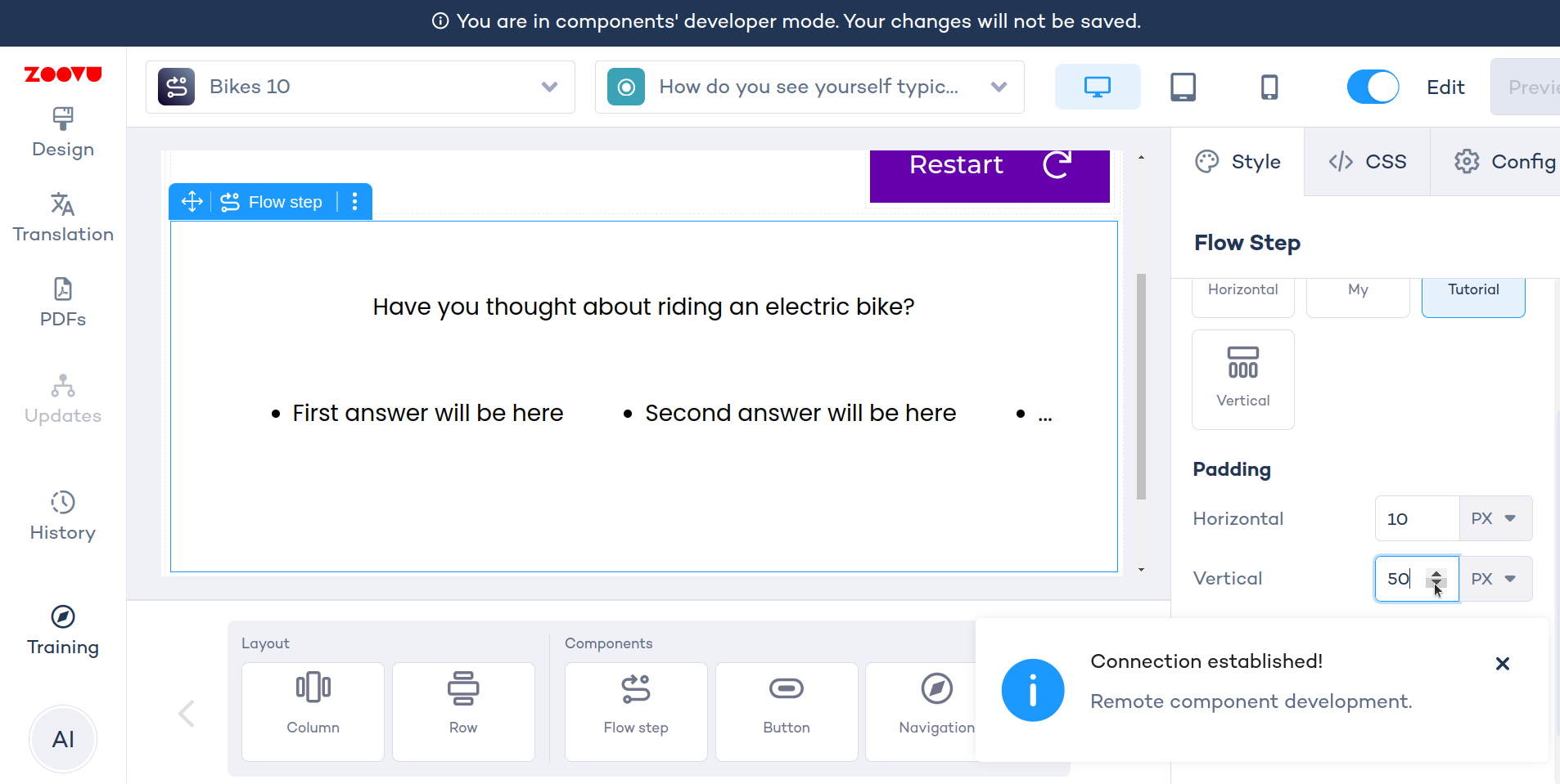
Test your right panel config
For example, change padding -> vertical to 50px and see that the setting is instantly injected into the component.