Style answers
Let's set up the right panel configuration and styling for the answer component.
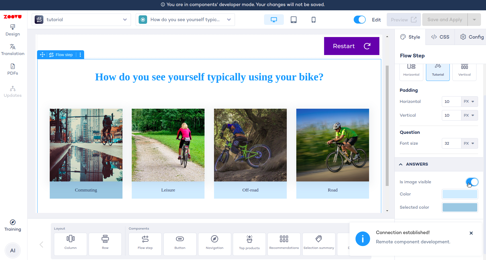
The result will look like this:
Create an answer preset
Define which elements and functionalities will be included in the answer component's right panel configuration. Begin by creating a preset for your answer component. This is where you decide which elements can be customized, e.g. the image or colors used for styling answers and selected answers.
import { boolean, color, EmbeddedComponentParameterFormat, object } from "@zoovu/theme-editor-parameter-types";

export const answerPreset = object({
    isImageVisible: boolean({ label: "Is image visible", default: true }),
    color: color({
        label: "Color",
        default: "#D2EDFF",
    }),
    selectedColor: color({
        label: "Selected color",
        default: "#9ECAE1",
    }),
}, { label: "Answers", format: EmbeddedComponentParameterFormat.ACCORDION })
Create an answer configuration
Next, make sure the actual configuration matches your answer preset exactly. Values from the preset will be injected into the AnswerConfiguration object and then used within the Vue component.
export class AnswerConfiguration {
    isImageVisible = true;
    color = "#D2EDFF"
    selectedColor = "#9ECAE1"
}
Use the configuration in styles file
Now, let's write a function that takes configuration as arguments and returns css
import { ComponentStyleDefinition } from "@zoovu/runner-browser-api";
import { AnswerConfiguration } from "./answer.configuration";

export const answerStyle: ComponentStyleDefinition<
    | "answer"
    | "imageWrapper"
    | "image"
    | "answerWrapper"
    | "answerWrapperSelected"
    | "answerTextWrapper"
    | "answerText"
> = {
    answer: {
        display: "flex",
        width: "220px",
        flexDirection: "column",
        justifyContent: "center",
        alignItems: "flex-start",
    },
    imageWrapper: {
        boxShadow: "0px 2px 6px -4px rgba(31, 58, 84, 0.10), 0px 4px 24px 8px rgba(31, 58, 84, 0.07)",
        width: "220px",
        height: "220px",
        position: "relative",
        overflow: "hidden",
    },
    image: {
        top: 0,
        left: 0,
        width: '100%',
        height: '100%',
        position: 'absolute',
        objectFit: 'cover',
        objectPosition: '50% 50%',
    },
    answerWrapper: {
        border: '1px solid transparent',
        cursor: 'pointer',
        '&:hover': {
            border: '1px solid #9ECAE1',
            boxShadow: '0px 6px 25px 0px rgba(0, 0, 0, 0.25)',
        },
    },
    answerWrapperSelected: (config: AnswerConfiguration) => ({
        '& $answerTextWrapper': {
            background: config.selectedColor,
        },
    }),
    answerTextWrapper: (config: AnswerConfiguration) => ({
        display: 'flex',
        width: 'calc(100% - 32px)',
        padding: '11px 16px',
        justifyContent: 'center',
        alignItems: 'center',
        gap: '8px',
        background: config.color,
        textAlign: 'center',
        flexDirection: 'column',
    }),
    answerText: {
        color: '#1F3A53',
        fontFamily: 'Campton, serif',
        fontSize: '14px',
        fontStyle: 'normal',
        fontWeight: 475,
        lineHeight: '130%',
        height: '30px',
        display: 'flex',
        flexDirection: 'column',
        justifyContent: 'center',
    },
};

export type AnswerStyle = Record<keyof typeof answerStyle, string>
Import the answer preset into the root preset
import { object, remoteComponentConfig, } from "@zoovu/theme-editor-parameter-types";
import { answerPreset } from "./components/answer/answer.preset";
import { paddingPreset } from "./util/padding/padding.preset";
import { questionPreset } from "./components/question/question.preset";

const flowStepPreset = remoteComponentConfig(
    object(
        {
            padding: paddingPreset,
            question: questionPreset,
            answer: answerPreset,
        },
        { label: "FlowStepComponent" }
    )
);

export default flowStepPreset;
Root configuration should be the same as root preset
The root configuration must match the root preset exactly. The preset values selected in Experience Designer are mapped onto the root configuration object. This configuration is then visible and can be used within the Vue component.
import { AnswerConfiguration } from "./components/answer/answer.configuration";
import { QuestionConfiguration } from "./components/question/question.configuration";
import { PaddingConfiguration } from "./util/padding/padding.configuration";


export class FlowStepConfiguration {
  padding: PaddingConfiguration = new PaddingConfiguration();
  question: QuestionConfiguration = new QuestionConfiguration();
  answer: AnswerConfiguration = new AnswerConfiguration();
}
Create an Answer vue component
We will get answerId and componentConfiguration as Props() passed from the root component.
styles will be injected via @ComponentStyle
We will use CSS classes prepared in answer.style.ts: answerWrapper, image, answerWrapperSelected, etc.
To conditionally show the answer image, we'll use the boolean componentConfiguration.isImageVisible.
Refer to the API documentation to learn how to fetch an answer using zoovuFacade
<template>
  <div
      @click="handleToggleSelection"
      :class="[styles.answer, styles.answerWrapper, { [styles.answerWrapperSelected]: isSelected }]"
  >
    <div :class="styles.imageWrapper" v-if="componentConfiguration.isImageVisible">
      <img :class="styles.image" :src="image" :alt="answerText">
    </div>
    <div :class="styles.answerTextWrapper">
      <div :class="styles.answerText">
        {{ answerText }}
      </div>
    </div>
  </div>
</template>

<script lang="ts">
import { Component, ComponentConfig, ComponentStyle, Mixins, Prop } from "@zoovu/runner-browser-api";
import { Answer, ZoovuFacadeMixin } from "@zoovu/exd-api";

import { AnswerConfiguration } from "./answer.configuration";
import { AnswerStyle, answerStyle } from "./answer.style";

@Component({})
export default class AnswerComponent extends Mixins(ZoovuFacadeMixin) {
  @Prop()
  answerId: number;

  @ComponentConfig(AnswerConfiguration)
  componentConfiguration: AnswerConfiguration;

  @ComponentStyle(answerStyle)
  styles: AnswerStyle;

  get answer(): Answer {
    return this.zoovuFacade.useAnswer(this.answerId);
  }

  get answerText(): string {
    return this.answer.text;
  }

  get isSelected(): boolean {
    return this.answer.selected;
  }

  handleToggleSelection(): void {
    this.answer.toggleSelection();
  }

  get image(): string {
    return this.answer.images[0] ?? "";
  }
}
</script>
Use the Answer component in the root component
We will get answer IDs from this.question.answerIds
<template>
  <div :class="[styles.mainContainer]">
    <question-component
        :questionText="questionText"
        :component-configuration="componentConfiguration.question"
    />
    <div :class="styles.answers">
      <answer-component
          v-for="answerId in answerIds"
          :answer-id="answerId"
          :key="answerId"
          :styles="styles"
          :component-configuration="componentConfiguration.answer"
      />
    </div>
  </div>
</template>

<script lang="ts">
import { Component, ComponentConfig, ComponentStyle, Mixins, } from "@zoovu/runner-browser-api";

import { FlowStepConfiguration } from "./flow-step.configuration";
import { FlowStepStyle, flowStepStyle } from "./flow-step.style";
import { Question, ZoovuFacadeMixin, } from "@zoovu/exd-api";
import QuestionComponent from "./components/question/question.vue";
import AnswerComponent from "./components/answer/answer.vue";

@Component({
  components: { QuestionComponent, AnswerComponent },
})
export default class FlowStepComponent extends Mixins(ZoovuFacadeMixin) {
  @ComponentConfig(FlowStepConfiguration)
  componentConfiguration: FlowStepConfiguration;

  @ComponentStyle(flowStepStyle)
  styles: FlowStepStyle;

  get question(): Question {
    return this.zoovuFacade.firstQuestionFromCurrentPage;
  }

  get questionText(): string {
    return this.question.text;
  }

  get answerIds(): number[] {
    return this.question.answerIds;
  }
}
</script>

<style lang="css" scoped>
@import url('https://fonts.googleapis.com/css?family=Poppins');
</style>
Test your Answer component
For example, change Answers -> Is image visible to false and see that the setting is instantly injected into the component.