Image carousel
The carousel lets users swipe through multiple product images inside the recommendations component.
Before you start:
- The
EXPERIENCE_DESIGNER_CAROUSEL_COMPONENTfeature flag must be enabled for the account. - The assistant must use a Data Platform integration. Right now, this feature is not available for Unified Assistants.
Step 1: Upload multiple images per product
You can do this via the Data Platform UI or the API.
Option 1: API
Use the images upload API to push multiple images per product programmatically. This is useful for bulk operations across a large catalog. Learn more.
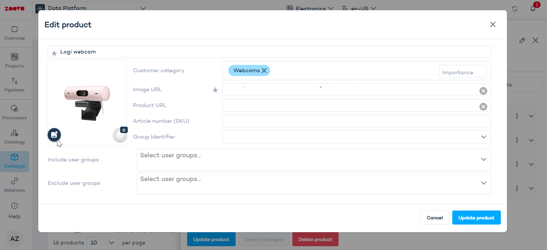
Option 2: Data Platform > Catalogs
- In Data Platform, go to Catalogs > Products.
- Find the product you want to update and click to edit it.
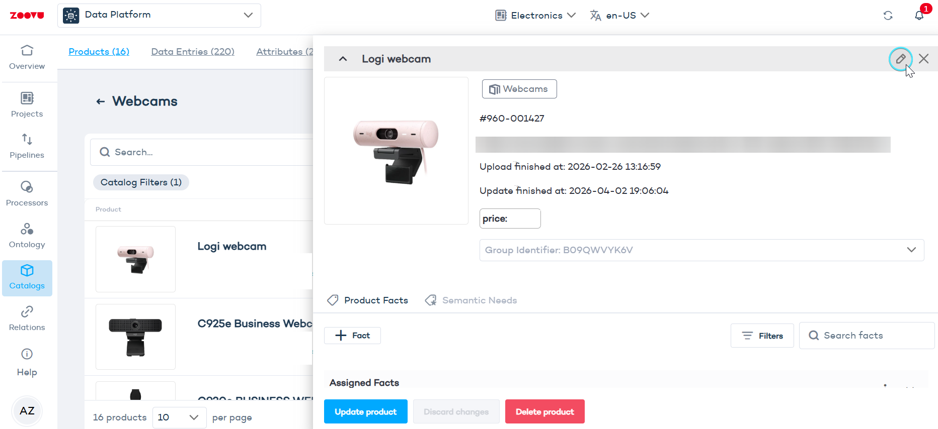
- Click Add images. The Media Manager will open.
- Click
+ Mediaand upload your images. - Save.
Step 2: Enable the carousel in Experience Designer
- Open your assistant in Conversation Studio.
- Go to the Design tab and open Experience Designer (EXD).
- Navigate to the results page and select the
Product imagecomponent. - Toggle on
Multiple images. - Choose your display style:
- Carousel (gallery) — a swipeable image gallery.
- Dot slider ��— navigation dots appear below the image, one per photo.
- Save your changes.
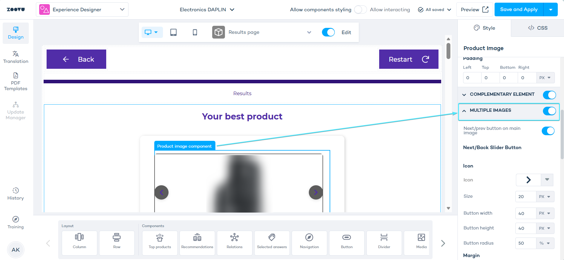
Configuration in Experience Designer
Next/prev buttons
Once Multiple images is on, you can enable Next/prev button on main image. This adds navigation arrows directly on the product image.
Under Next/Back Slider Button, configure:
- Icon — choose the arrow style and size
- Button width, height and radius — controls the button shape (50% radius = circular)
- Margin — adjust spacing around the buttons
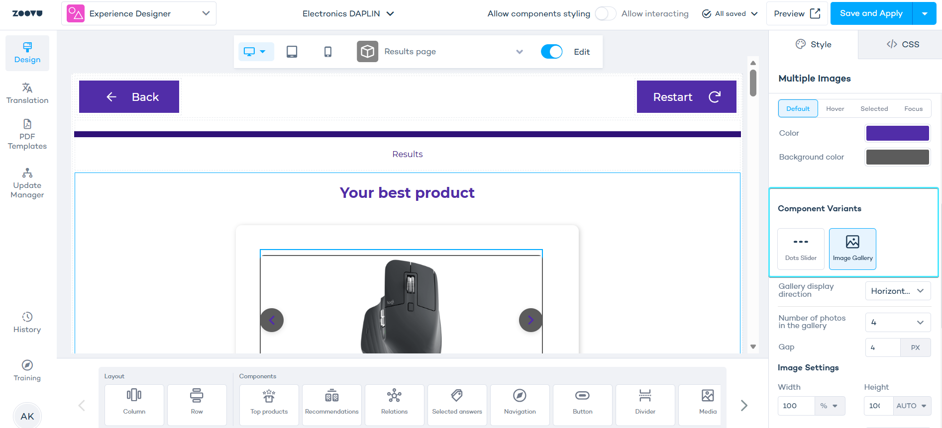
Component variant
Scroll down to Component Variants and pick your display style.
- Dots Slider — shows one dot per image below the main photo.
- Image Gallery — displays thumbnail images the user can click to switch the main view.
- Carousel works well for any number of images.
- Dot slider looks great with a small set of images (2–4). With many images, you get a dot for each one, which quickly becomes cluttered. Stick to carousel if your products have more than a handful of photos.
Before selecting a variant, you can also set button colors (Default / Hover / Selected / Focus states) to match your brand.
Image Gallery settings
When Image Gallery is selected, you get additional controls:
- Gallery display direction — horizontal or vertical thumbnail strip
- Number of photos in the gallery — how many thumbnails are visible at once
- Gap — spacing between thumbnails (px)
Under Image Settings:
- Width / Height — size of each thumbnail
- Object fit — how the image fills its container (
Containkeeps the full image visible) - Margin — spacing around each thumbnail
- Under Selected Image Settings, style the active/highlighted thumbnail across its interaction states (Default, Hover, Selected, Focus).