Experience Designer components
Experience Designer offers layout components and content components to help structure and style your experiences.
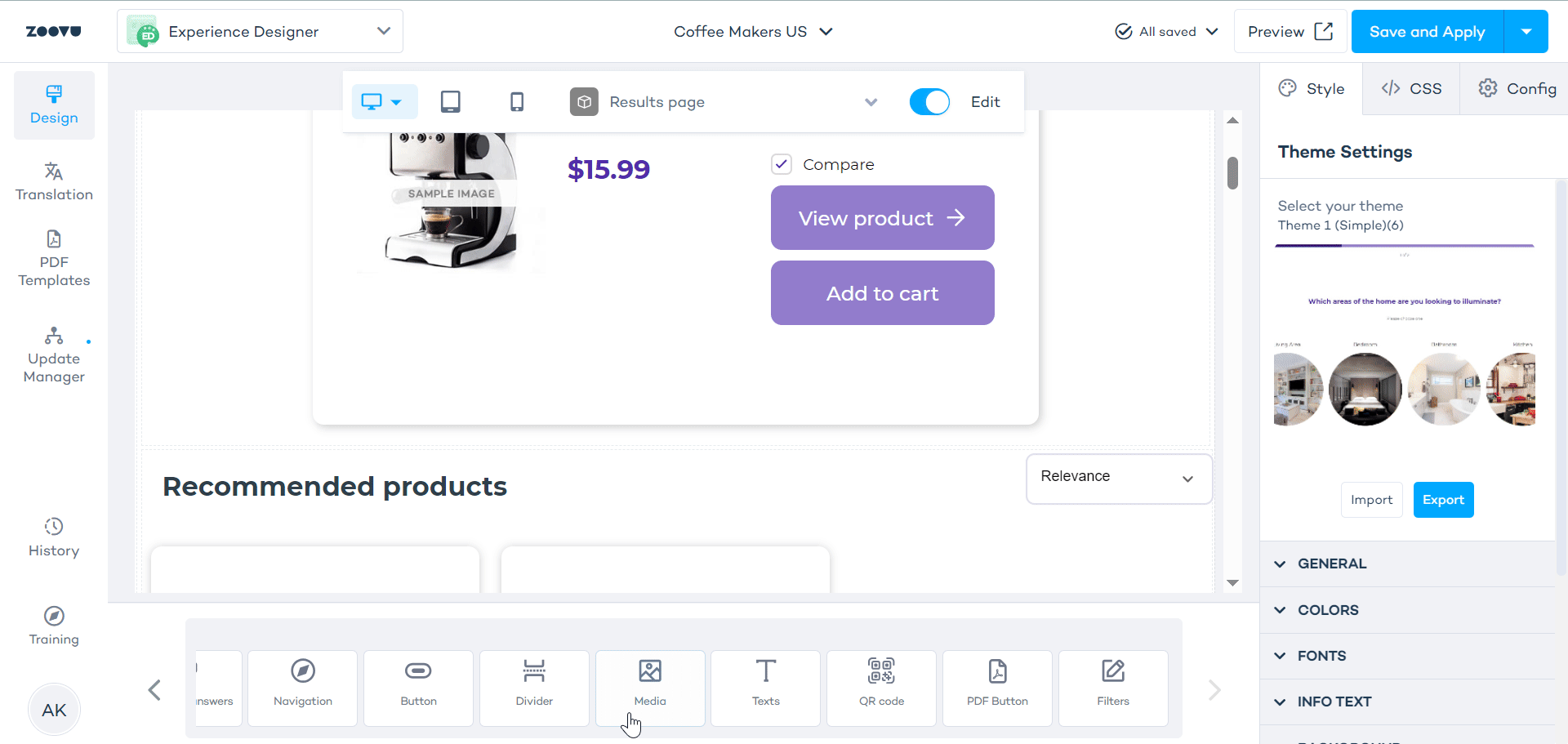
By default, components inherit theme settings - but you can style them individually.
- Add components by double-clicking on them or by dragging and droppoing them onto the canvas.
- Edit components by selecting them on the canvas, which opens the right-hand settings menu.
- Delete components by clicking the three dots next to the component's label and selecting "Delete":
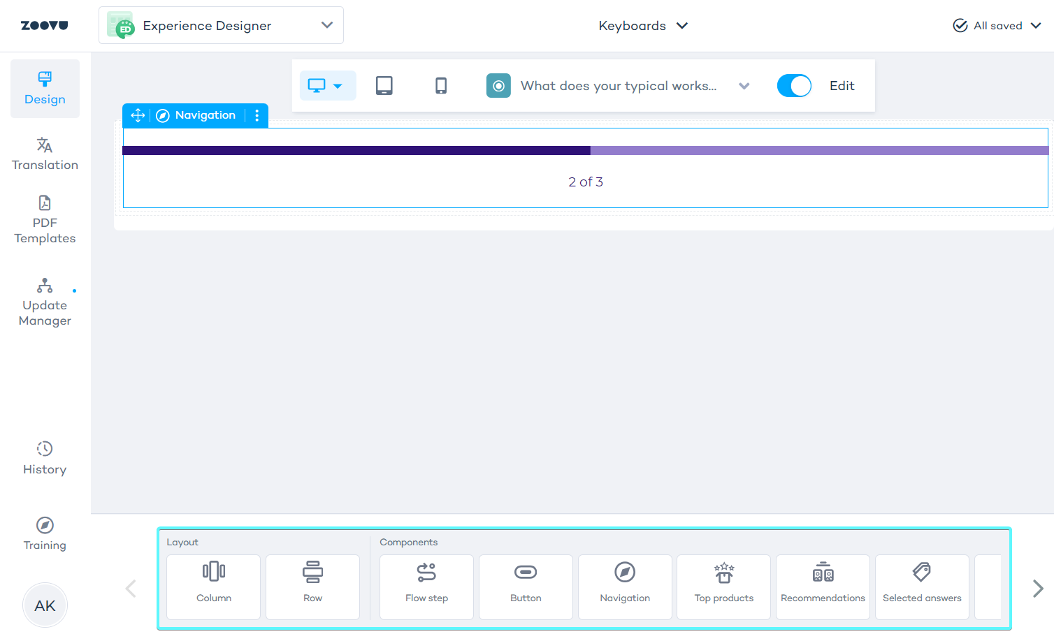
Layout Components
Layout components organize the experience's structure.
Rows
A row organizes content horizontally within the assistant. It acts as a container where other components can be added: columns, buttons, images etc.
Learn more.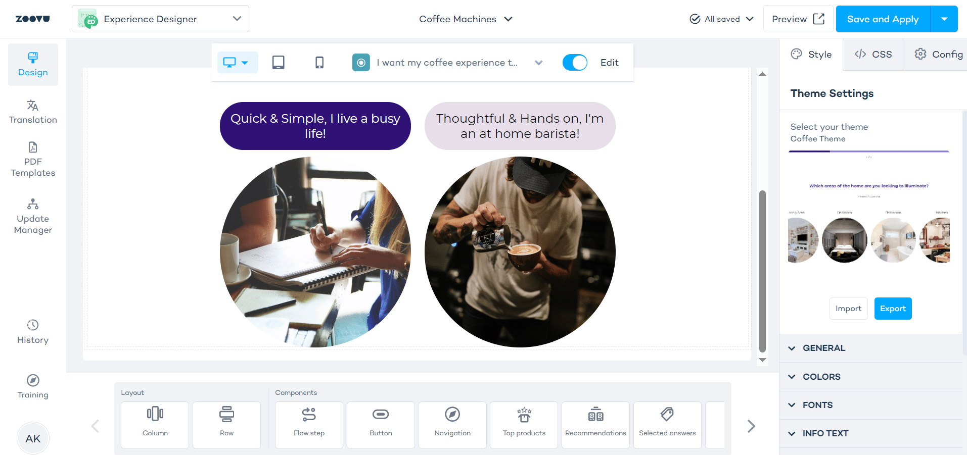
Columns
Columns are used to stack components in a vertical order within rows or directly on the canvas.
Learn more.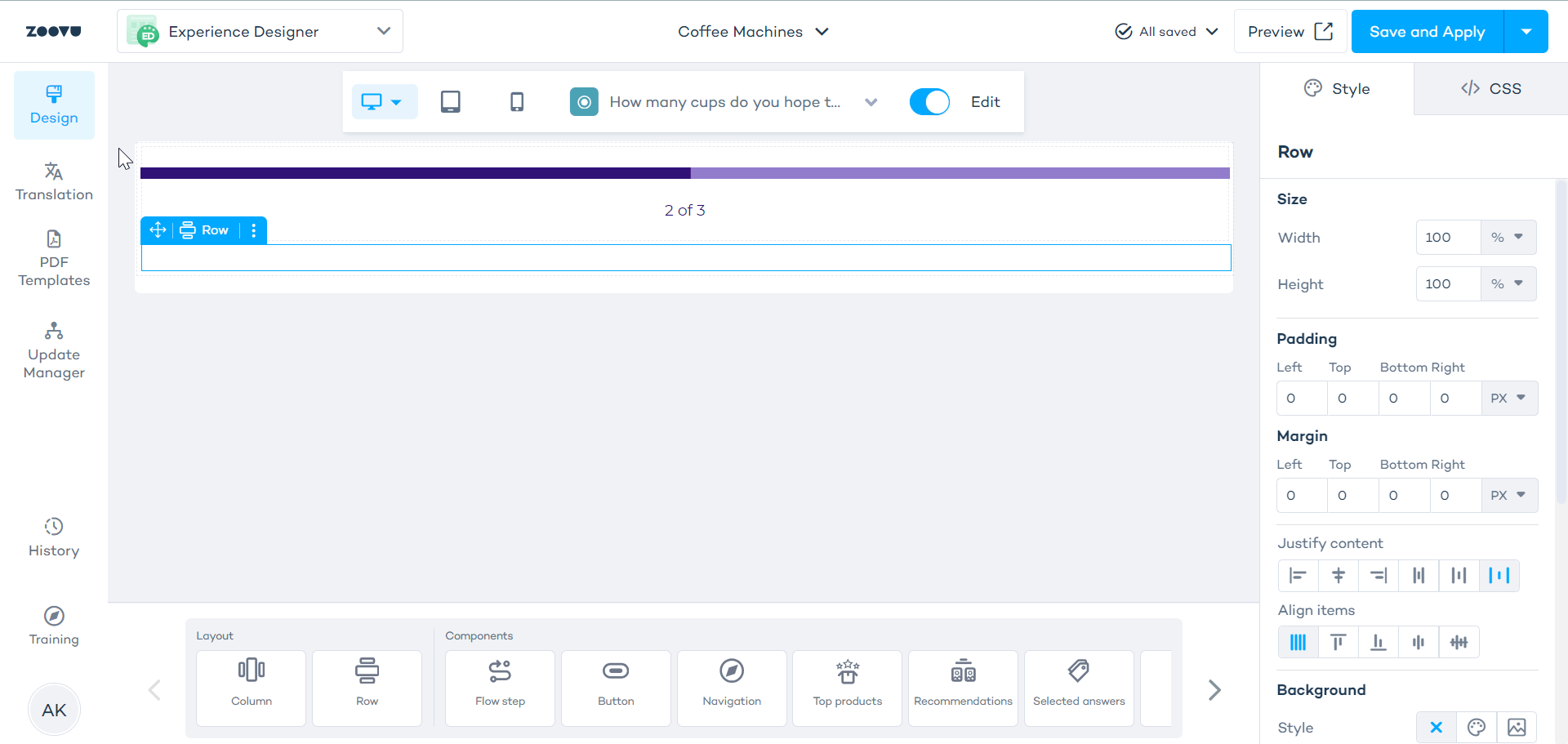
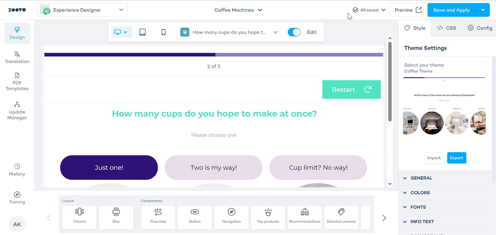
Content Components
Content components allow you to populate your experience with visual and interactive elements.
Flow step
The Flow Step component is where you style the questions and answers in your assistant. It supports all types of assistants, including Digital Assistants and Visual Configurators.
Learn more.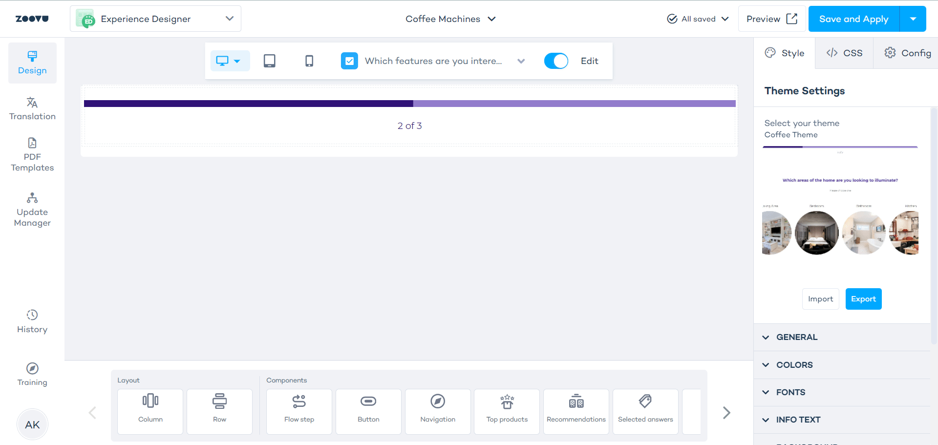
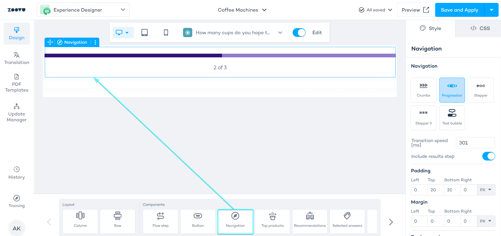
Navigation
The navigation component helps users track their progress through the assistant. It indicates the current step and assists in transitioning between questions and results.
Navigation can be added to both the question flow and results pages. You can apply different navigation styles to each section.
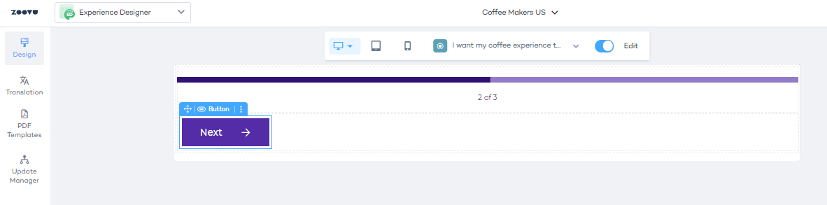
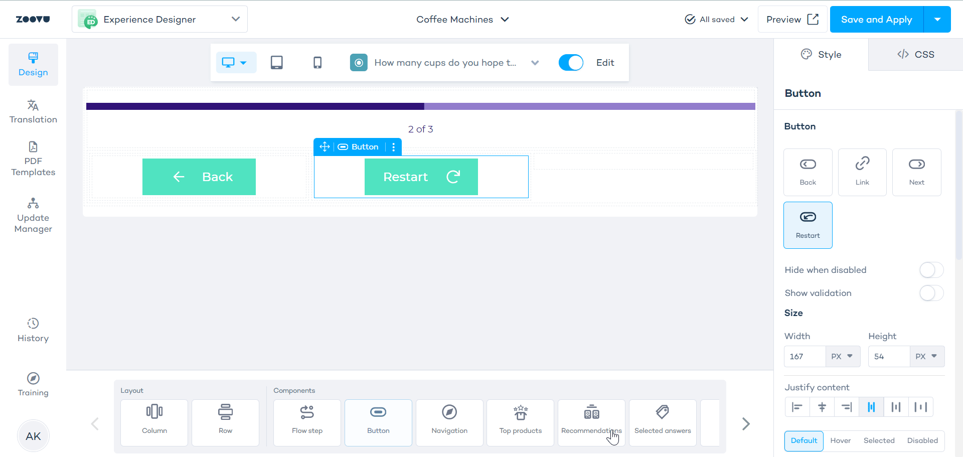
Button
Buttons can be used for navigation (e.g. the "Next" and "Restart" buttons) or for CTAs such as "Add to cart".
The easiest way to manage buttons is to nest them inside rows or columns.
"Next" is the default button, but you can adjust the button type and styling by selecting it on the canvas, which opens the right-hand settings menu.
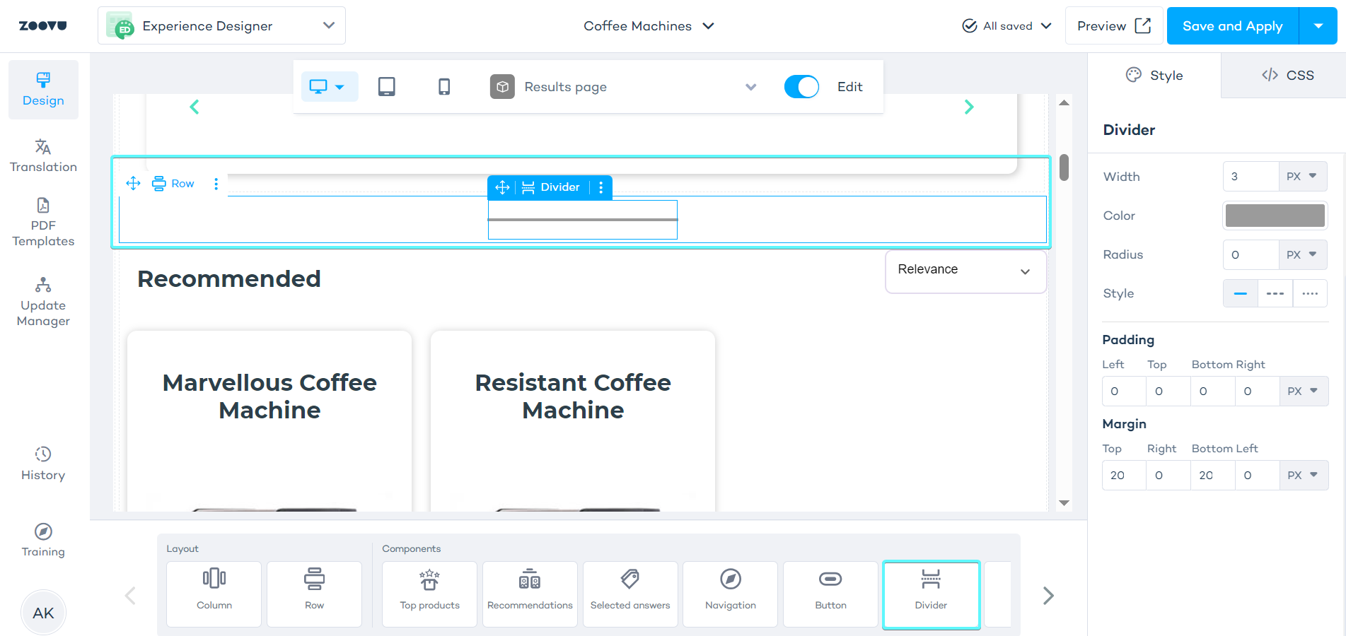
Divider
A divider adds a visual line (vertical or horizontal) between components to separate sections or highlight distinctions.
Dividers can be nested inside rows or columns. You can add multiple dividers for better visual structure.
Media
Add images, videos, or YouTube links to your flow or results page.
Drag the media component from the Components list to the canvas. Place them inside rows or columns to make styling easier.
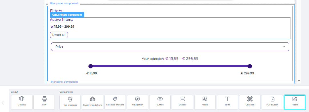
Filters
Filters help users refine their product search. To add filters to your results page, first configure them in Conversation Studio. Learn more.
There are several subcomponents within Filters, which you can style independently of one another. Hover your mouse over different parts of the filters panel on your canvas, then click to select the subcomponent.
- Panel title component lets you style the main text above the filters. The text itself can be edited in Conversation Studio > Design > Filters.
- The entire filter panel component. You can add a different background to it, so that it stands out in the results page.
- Active filters component informs the users about filters that are currently applied to the results.
- There can be one or more Filter components. Each filter has its own type (e.g. slider) and dedicated settings.
Top Products
Showcase top products on the Results Page. Choose from various layouts to find the one that best fits your design.
Learn more.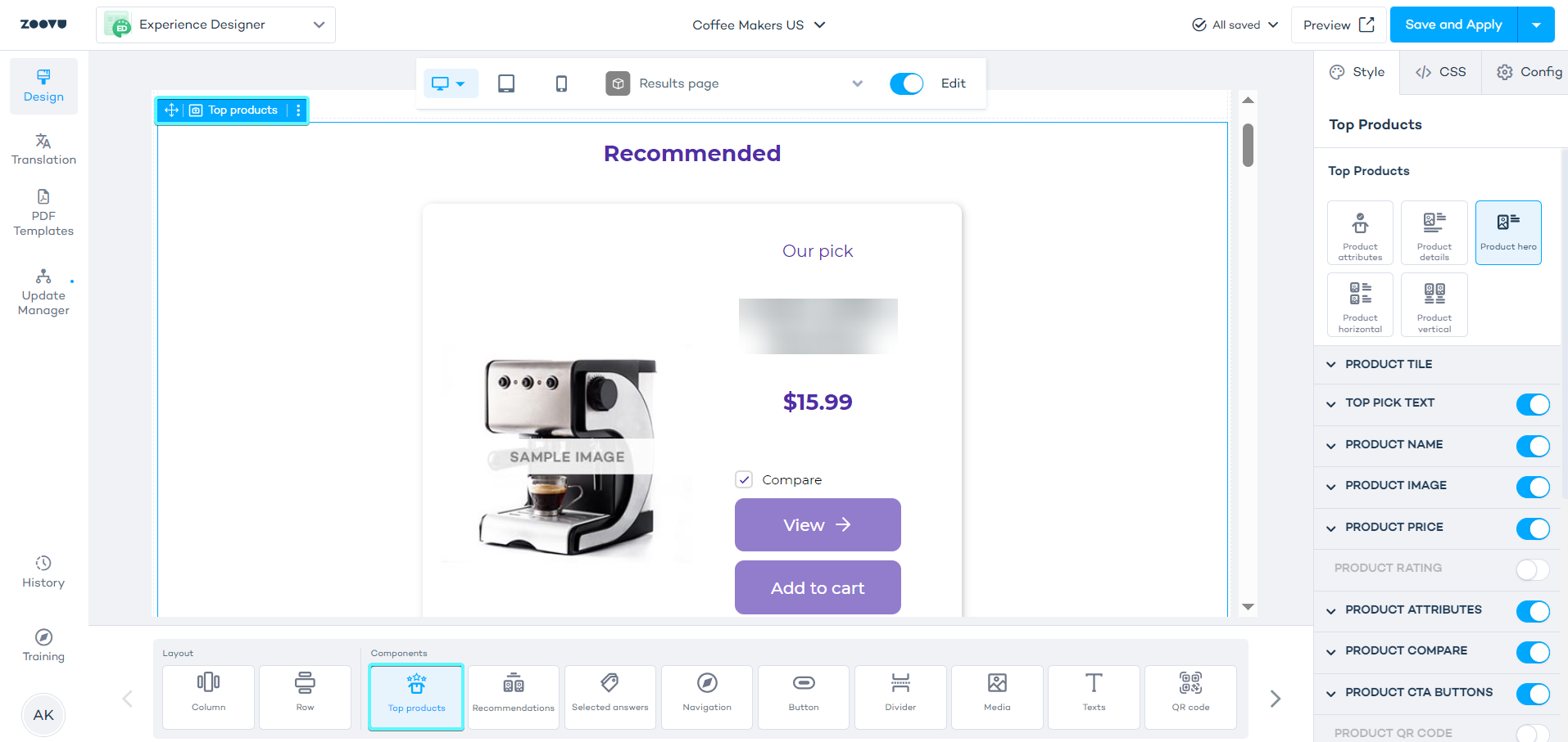
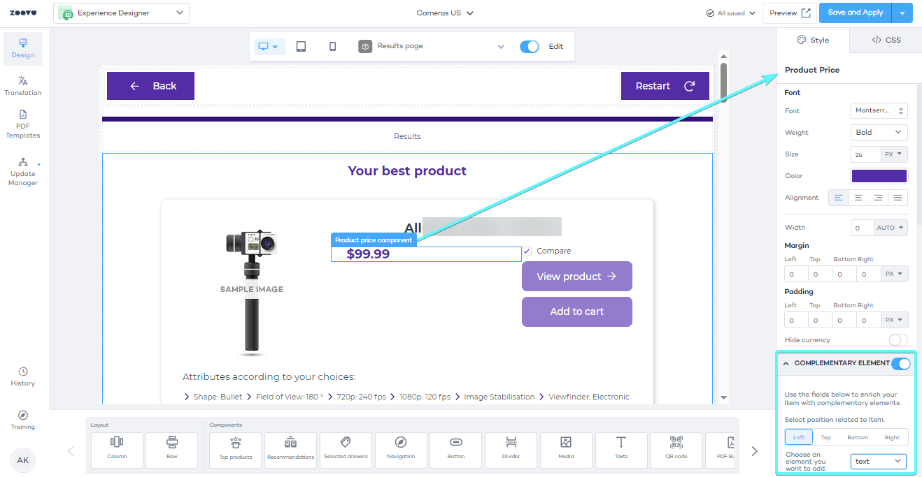
Complementary element
Add additional information to products, e.g. extra text or icons. Complementary elements can be applied to subcomponents like product name, price, and image.
You will find complementary element settings in the right-hand settings bar, below the subcomponent's main settings. Here, you can add an element such as text by choosing it from the dropdown selector, and then style it.
Bundles component for Recommendations
With this component, you can display highlighted or regular product categories separately and customize recommendations for Bundle Assistants.
Learn more.