Customize a theme
Experience Designer allows you to create or modify themes for your experiences. You can choose an existing theme, make changes, or even export and import themes for updates.
Select a theme
To begin customizing, you need to choose a theme. You can select a theme when you first open Experience Designer or switch themes during your session. However, unsaved changes will be lost if you switch without saving.
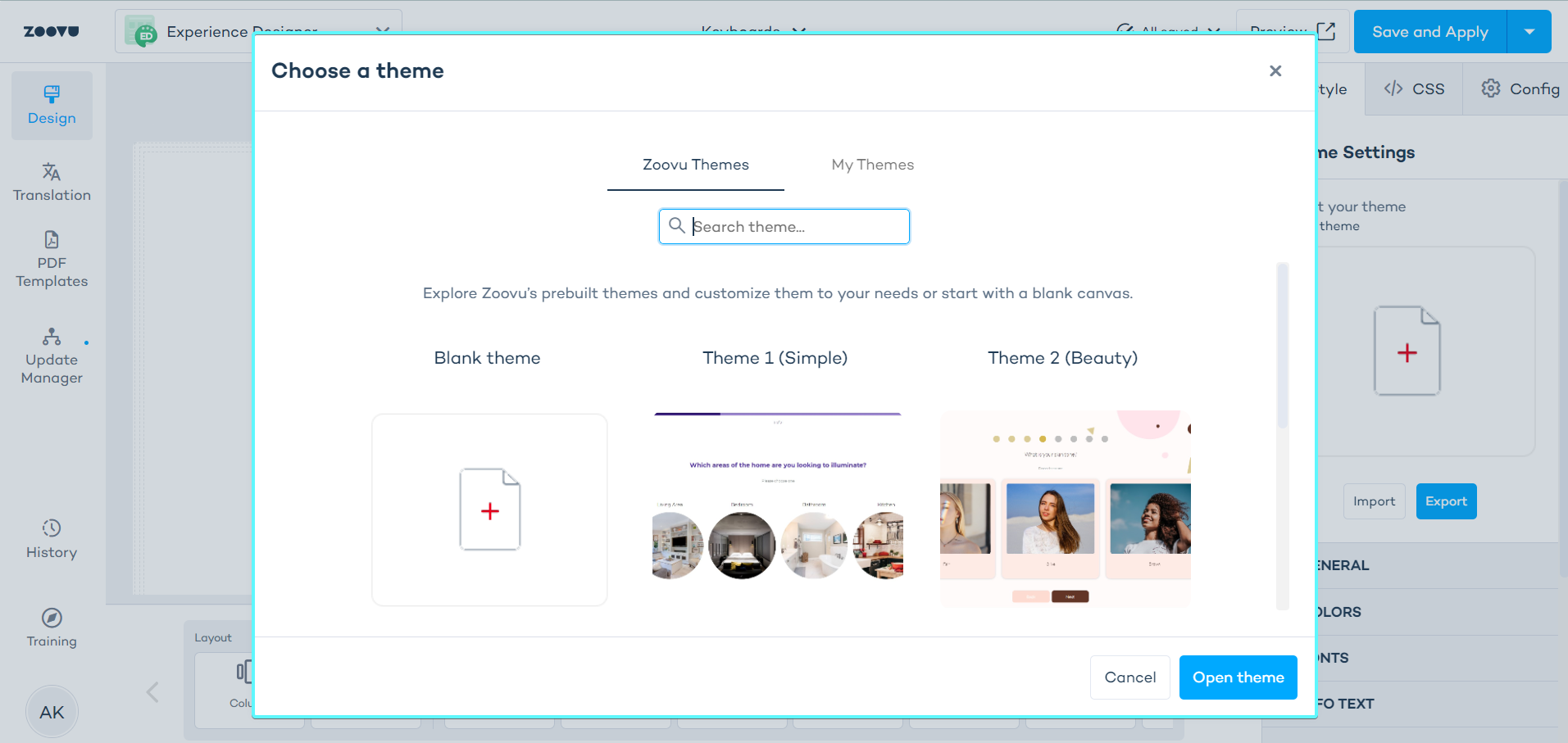
When you open Experience Designer, you’ll see a list of available themes:
- Zoovu Themes: This tab contains themes provided by Zoovu.
- My Themes: Here, you'll find themes you have created and saved.
To select a theme, click on its tile and then click the "Open theme" button at the bottom of the list.
Edit theme settings
Theme settings control the global appearance and behavior of your assistant. Any changes you make here will automatically apply to all components—unless you've customized a component separately.
To edit theme settings, click anywhere on the grey area around the canvas. The theme settings are available in the right-side settings menu.
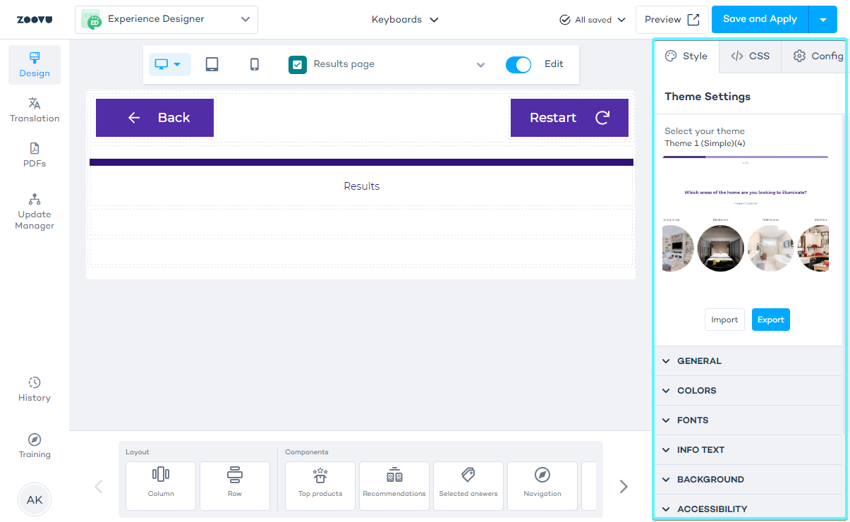
Theme settings apply globally to the entire theme in Experience Designer.
You can adjust settings in the following categories:
- General settings
- Theme colors
- Theme fonts
- Info text
- Background
- Accessibility
General settings
These settings control how users interact with the assistant and how pages transition.
- Advance to the next question – Moves users to the next question after they select an answer (only for single-selection answers).
- Scroll to top – Automatically scrolls to the top of the page when moving to a new question.
- Update URL on answer selection – Updates the assistant’s URL dynamically when users select an answer.
- Store states for reloading – Allows users to reload the page and return to the same state. (Note: This may impact performance.)
- Question transition – Adds a transition effect between pages (useful for animations).
- Always show results page – The results page will be displayed even if the theme uses custom components instead of standard ones.
Theme colors
Theme colors set the overall color scheme for your assistant. These colors apply automatically to all components.
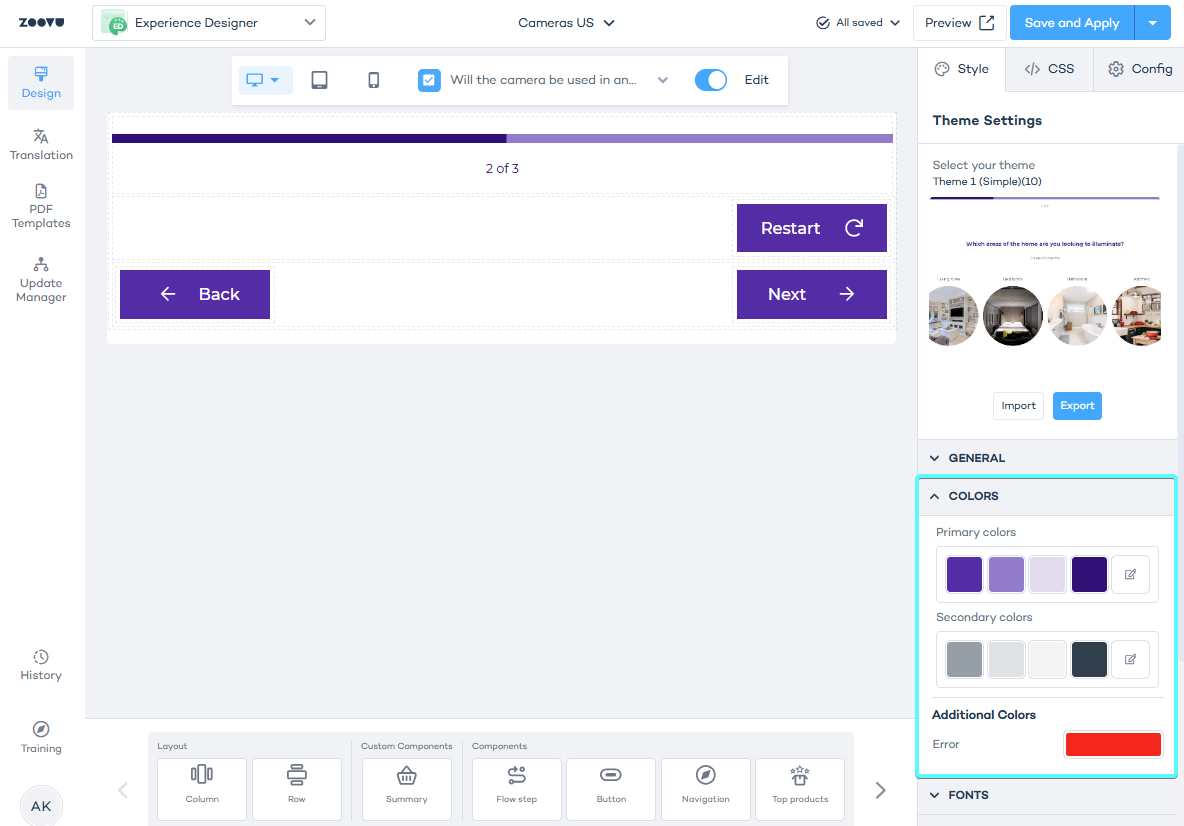
If you need to change the color of a specific component without affecting the entire theme:
- Select the component on the canvas.
- In the right-side settings panel, adjust the color settings for that component.
- The new color will override the theme color for that component only.
Best practice: Set up your theme colors before adjusting individual component colors.
Theme fonts
Similar to theme colors, fonts set at the theme level apply globally to all components.
Theme info text
Info text appears throughout the assistant and follows a consistent style. Instead of adjusting each instance separately, you can modify info text styling at the theme level to create a uniform look.
Theme background
The background setting applies to the entire assistant. It creates a uniform appearance across all screens.
Theme accessibility
Standard accessibility texts can be translated to improve user experience for different language audiences.
Learn more.